Council on the Ageing NSW
Clear, accessible design across brand and communications.
Council on the
Ageing NSW
2026
Brand identity · Editorial design ·
Digital communications · Event collateral · Educational videos
Creative &
Design Lead
At a glance
The challenge
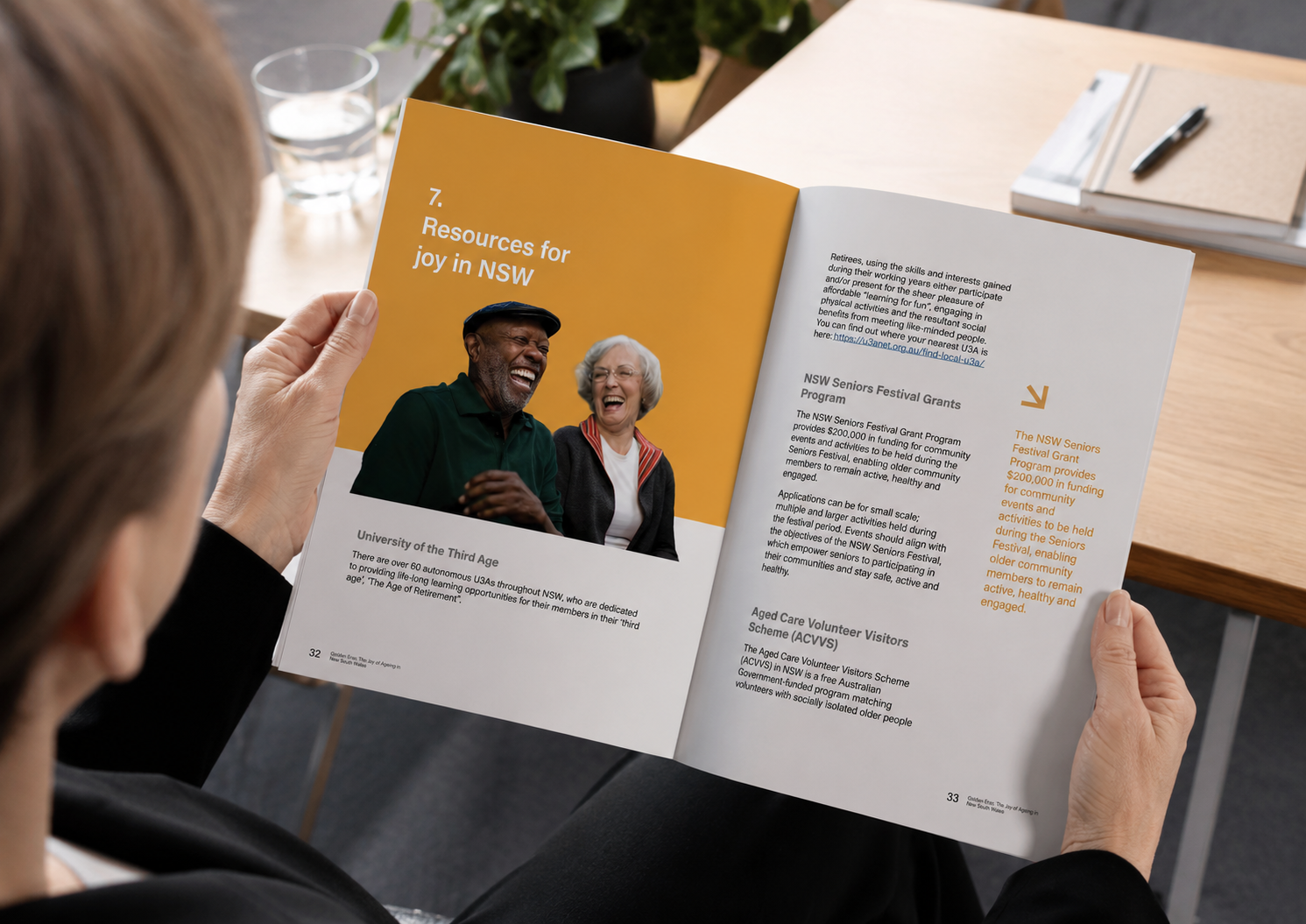
COTA NSW communicates with a broad audience across many different formats — from reports and campaigns to events and digital resources. The challenge was to create communications that felt consistent and engaging while keeping information clear, accessible and easy to navigate, particularly for older audiences.
What we did
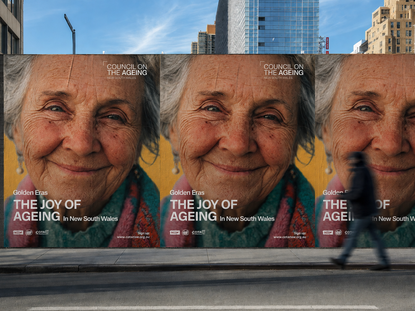
We refined the COTA NSW logo to improve its visibility, balance and simplicity, creating a stronger foundation for the wider visual identity. We designed the annual report to balance detailed information with readability and visual engagement, then extended the visual language across social media, e-invites and conference collateral, including a large-scale media wall. We also created an educational video for the Active and Healthy website, breaking the experience into clear, easy-to-follow steps for older people with different levels of digital confidence.
The outcome
The result is a clearer and more consistent visual presence across print, digital and physical spaces.
From detailed reports to short educational content, each piece was designed around the same principle: making information easier to see, understand and use.

