Selected clients
In good company.






EnBetween is a Melbourne (Naarm) design consultancy working across brand, print, digital products and accessibility. We help government, not-for-profits and purpose-driven organisations turn complex ideas into clear, useful and inclusive experiences.
Brand, print, web and digital product design — from early thinking through to final delivery.
Accessibility audits, inclusive design reviews and practical training to help your team create experiences that work for more people.
Accessible learning, workshops and resources that help communities build digital confidence and stay safer online.
Across brand, print, web and digital product design.
We've worked across government, not-for-profits, community organisations and business.
Accessibility and different ways of thinking, communicating and navigating are considered from the beginning.
Work directly with the senior designer doing the thinking and the work.
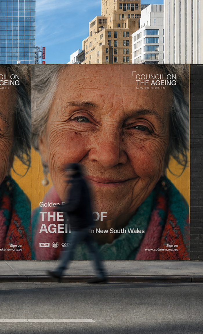
Creating a clearer, more accessible visual identity across editorial, digital and event communications.
Council on the Ageing New South Wales (COTA NSW) - 2026
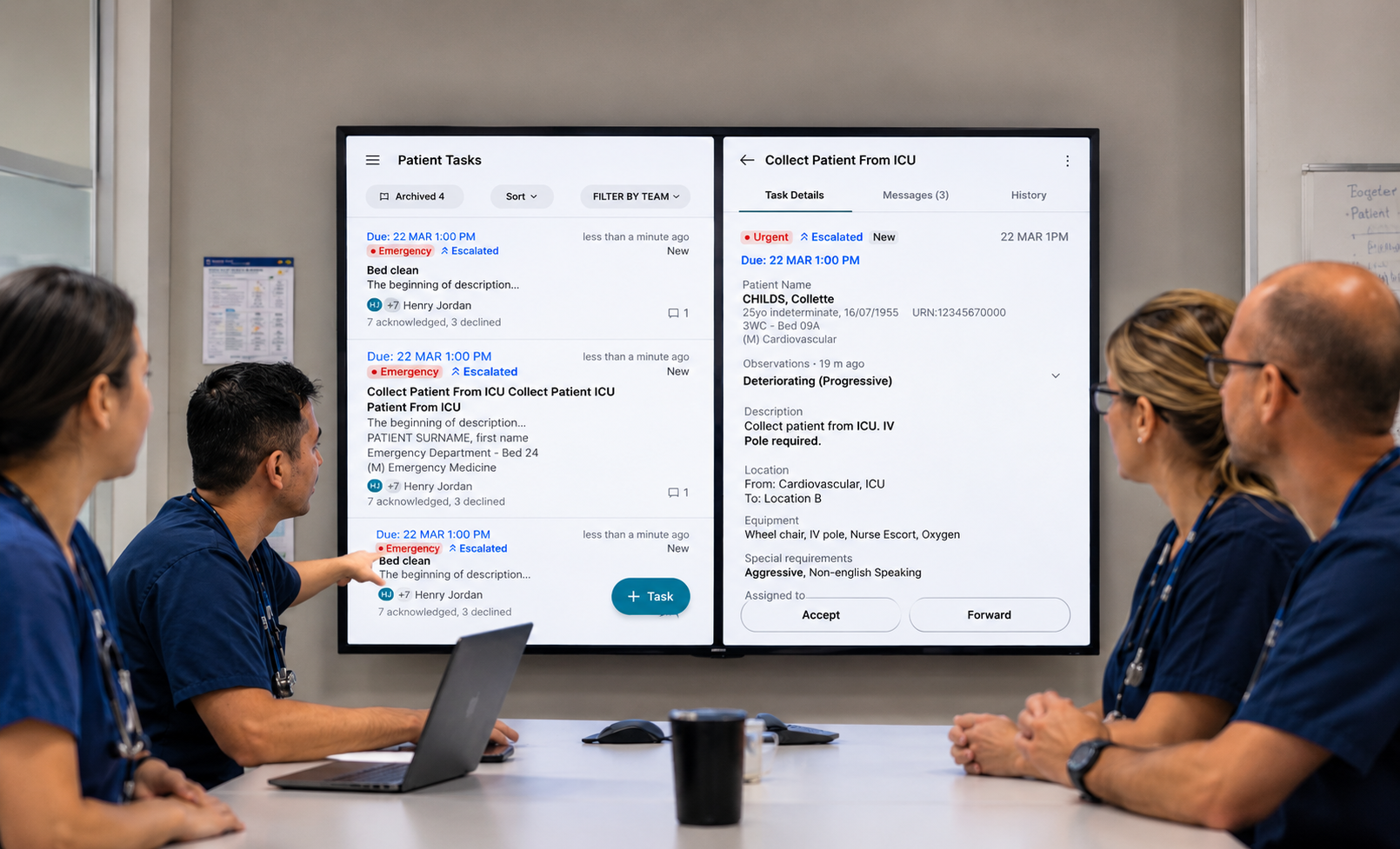
Designing native mobile workflows that help clinical teams coordinate tasks and act on critical information faster.
Medtasker - 2024
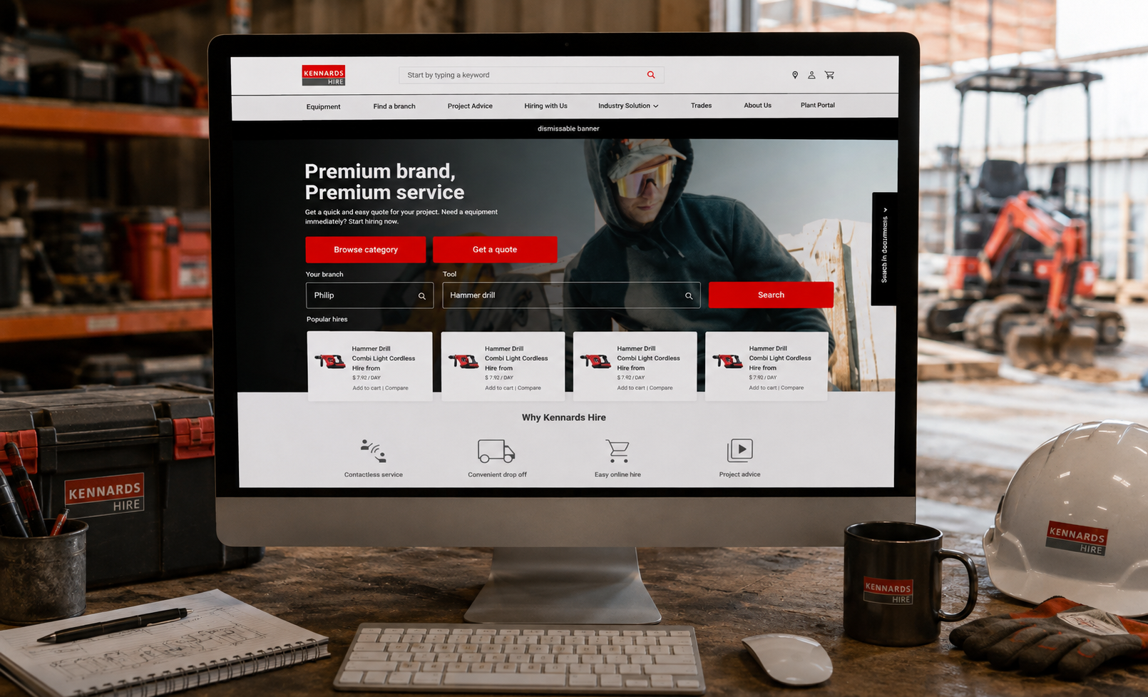
Redesigning the responsive hire experience to make finding, booking and managing equipment simpler across web and mobile.
Kennards Hire - 2023

Whether you're starting something new, improving something existing, or not quite sure what you need yet, we'd be happy to hear about it.

